← previous - home - next →
Table of contents
- 1-2 Introduction and Line plots
- 3-4 Figures and Subplots
- 5-6 Styles and Aesthetics
- 7-8 Saving and Color maps
- 9 Histograms
- 10-11 Boxplots Violinplots and Scatter plots ← (Notebook)
- 12 Animations
- 13 On the usage of Seaborn
10. Boxplots and violin plots
Another way to look at distribution is to use boxplots:
import numpy as np
import matplotlib as mpl
import matplotlib.pyplot as plt

np.random.seed(2)
mean = np.random.uniform(-10, 10, size=5)
std = np.random.uniform(1, 5, size=5)
data = np.random.normal(loc=mean, scale=std, size=(1000, 5))
labels = [f'Mean: {m:.2f}, std: {s:.2f}' for m, s in zip(mean, std)]
fig, ax = plt.subplots(figsize=(6, 5))
ax.boxplot(data, labels=labels);
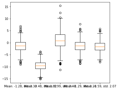
Slightly better but the labels are overlapping.
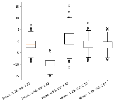
We can modify that by changing the setting the labels afterwards:
fig, ax = plt.subplots(figsize=(6, 5))
ax.boxplot(data)
ax.set_xticklabels(labels, rotation=30, ha='right');
fig, ax = plt.subplots(figsize=(6, 5))
ax.boxplot(data)
ax.set_xticklabels(labels, rotation=90);
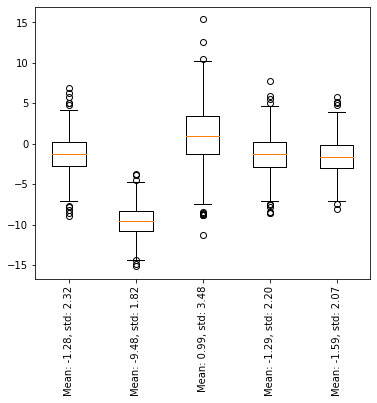
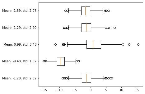
Though, as a general point, it is not advised to ask your reader/audience to bend their head. A far better solution is the following:
fig, ax = plt.subplots(figsize=(6, 5))
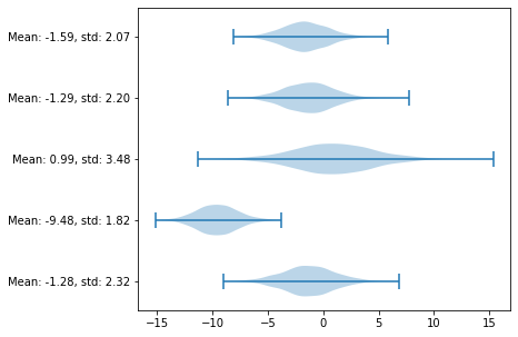
ax.boxplot(data, labels=labels, vert=False);
A similar way to visualise your data is using violin plots:
fig, ax = plt.subplots(figsize=(6, 5))
ax.violinplot(data, vert=False);
ax.set_yticks(range(1, data.shape[1]+1))
ax.set_yticklabels(labels);
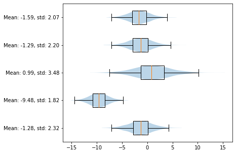
Or combining both since they provide since they don’t provide exactly the same informations
fig, ax = plt.subplots(figsize=(6, 5))
ax.boxplot(data, labels=labels, vert=False, zorder=100, sym='')
ax.violinplot(data, showextrema=False, vert=False);
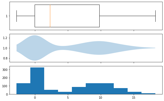
When looking at unimodal distribution, looking at boxplots is sufficient, it is not the case for multimodal distributions, we are losing too much information:
np.random.seed(0)
d1 = np.random.normal(0, 1, size=500)
d2 = np.random.normal(10, 3, size=500)
d_multi = np.hstack([d1, d2])
fig, ax = plt.subplots(3, 1, figsize=(8, 5), sharex=True)
ax[0].boxplot(d_multi, vert=False, widths=.8);
ax[1].violinplot(d_multi, showextrema=False, vert=False);
ax[2].hist(d_multi);
fig.tight_layout()
11. Scatter plots
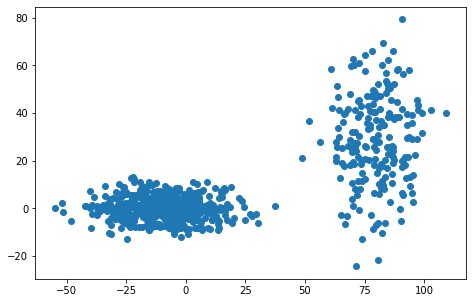
Scatter plots are useful when one wants to look at two measurements from and their potential correlation
X = np.random.normal(-10, 15, size = 500)
Y = np.random.normal(0, 5, size = 500)
X = np.hstack([X, np.random.normal(80, 10, size = 200)])
Y = np.hstack([Y, np.random.normal(30, 20, size = 200)])
fig, ax = plt.subplots(figsize=(8, 5))
ax.scatter(X, Y)
ax.set_aspect('equal')
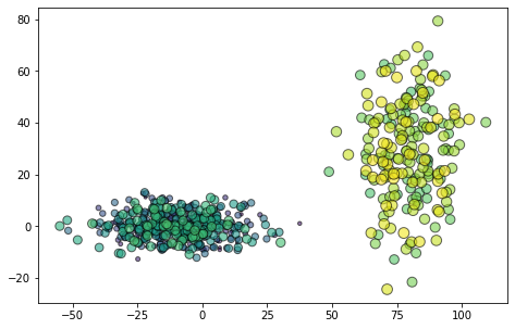
Colours and sizes can be assigned to each point:
cmap = mpl.cm.get_cmap('viridis')
colors = np.linspace(0, 1, 700)
sizes = np.linspace(5, 100, 700)
fig, ax = plt.subplots(figsize=(8, 5))
ax.scatter(X, Y, color=cmap(colors), s=sizes, alpha=.6, edgecolor='k')
ax.set_aspect('equal')
← previous - home - next →